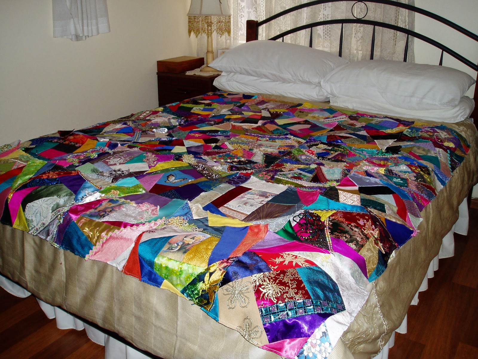
I have made 36 x 11 inch (28 cm) squares to make a crazy quilt for my spare double bed (six rows of six blocks). So far, only a few of them have been embellished, most are blanks which will be portable projects to work on while waiting for DH to have radiation and oncology visits. I am also culling my stash so by making cq blanks which can be packed away into tubs for future projects, I can use my favourite pieces of fabric, pin on some colour co-ordinating laces and trims to each block and pack it away. Then I can sort through the fabric pieces which are left and bundle them up to dispose of either on eBay or Gumtree at a later date. Here are the blocks laid out on the bed.
I would love some comments as to whether I should just sew the blocks together once they are embellished and continue the embroidery and embellishing over all the straight seams or whether I should stitch a border of black or other dark coloured fabric between each square for sashing......? At the moment the squares are laying on top of a gold/beige coloured quilt cover which looks like a wide border around the crazy quilting - I rather like the look of that wide border so I think that I will add a border like that to the quilt once the top is finished.
The Cream on cream quilt blocks (mostly blanks) are already packed away with a plastic container of cream and pearl laces and trims, gold beads, cream and mother-of-pearl buttons and flowers etc and a container of cream and gold threads.
Sunday, 4 May 2014
Monday, 7 April 2014
Colours of Widnes picture completed for my friend Jackie.
This is the finished picture of "Colours of Widnes".......black, all shades of grey, brassy gold........really miserable looking, depicting an abstract image of Widnes, Lancashire, England in the first half of the 20th century. The main image is an old postcard showing the tall chimneys of the factories belching smoke all over everything and the words "Widnes with the lid off makes the sun hide his face" written across the bottom. The Runcorn-Widnes transporter bridge is at the top because Jackie's grandfather worked on it. The photos don't show it but the wires supporting the bridge have been embroidered in a very fine Kreinik metallic thread which has a twist of steel blue and black. Because Jackie is a cat lover, I have included a little gold cat charm, sitting on the railway track at Widnes Station as a steam freight train pulls in on the other line.
The picture will be framed in a dull grey frame which at the moment is metallic gold but a few coats of dull, miserable looking, sooty, rainy-day coloured paint will do the trick!!
![]() | |||
| Abstract Crazy Quilted picture depicting the "Colours of Widnes" in Lancashire, UK |
![]() | ||
| Top half of the picture showing the Runcorn-Widnes Transporter Bridge. A few simple birds fill the void at the top while I tried to keep most of the stitching looking industrial rather than flowery. |
Monday, 24 March 2014
A new CQ challenge........Colours of Widnes
A friend of mine saw my "Colours of Sardinia" picture before I gave it to Ennio and Anna. She loved all the bright, clear colours of the Mediteranean island and commented "I wonder what the colours of Widnes would be - just a dirty grey town?" This friend is originally from Widnes which was an industrial town in Lancashire, England, with lots of chimneys belching out black smoke and soot all over everything and everyone. While it is not quite like that today, it certainly doesn't boast the lovely bright colours of Sardinia!! Well, that comment was like red rag to a bull, lol, and I love a challenge!! So I set to work collecting images of industrial Widnes and matching the images with black and grey fabric pieces. As a contrast to all this black and grey, I found a photo in a magazine of a brass plaque which says:
On Widnes Station
In 1965
Paul Simon
Wrote the Song
Homeward Bound
So the only other colours on this picture will be dull gold albeit brass. I have ordered some brass cog-wheels from someone on Ebay so it will be a bit "Steampunk" as well. Here is my blank canvas.....
Friday, 31 January 2014
Colori di Sardegna or Colours of Sardinia
After nearly six years I have finished another UFO!!!! Jumping for joy as I never thought I would ever see the end of this one. Six years ago some very good friends of ours who were originally from Sardinia in the Mediterranean and which is part of Italy, were building a new house. I promised I would make them a house-warming present and decided to create a crazy quilted picture entitled "Colori di Sardegna" or in English, "Colours of Sardinia". I set about collecting lots of photos from the net and from travel brochures to see just what Sardinia actually looked like - lots of bright, clear blues and turquoises in the sky and ocean, buildings in cream and pastels with terracotta tiles, flowers of pinks and reds..........easy!! Wrong.
Here it is, in it's frame although not yet fixed in the frame. Two views, one of the embroidery and one with the frame around the edge. I guess one of the positive things about spending a lot of time sitting at home with a husband who is having chemo for cancer and who often doesn't feel crash hot, is that I am getting a lot of UFOs completed. This one in particular has been my problem child from ages so it is soooooo good to be seeing the back of it. I just hope our Sardinian friends, Ennio and Anna, like it.
I tried to cover most aspects of the island from jewel coloured bays and beaches, sparkling white sand, a school of Sardines, Orange coral, rocky areas where tiny lizards bask in the sun, vivid blue Dragonflies (the wings are wired so they are 3D), grape growing areas, Poppies in the fields and ancient stone Nuraghi which are represented by the circles in the bottom right corner. It is not meant to be an actual picture but just to represent the colours...... The buildings and church were sewn ad-hoc so they are crooked and a bit crazy as they tumble down the hill but that is part of the look that I wanted to achieve. I hope it has worked because there is no way that I am going to change anything at this stage, it has taken too long.
This is my original pieced background - as you can see, a lot changed from this point onwards. I got rid of the heavy brown bits on the left. The bottom brown pieces were meant to represent rocks and frankly I have absolutely no idea now what the top pieces were supposed to be - not a clue!! The houses in the village got removed and replaced by more realistic looking buildings while the church..........that church gave me so many problems and in the end I gave up. I got half way through it and lost the plot. So it stayed rolled up in my cupboard for a further four years and every time I looked at it, I shuddered because I'd done too much to throw it away but yet I couldn't see where to go next. I think it was the church that threw me. I used a scrap of material that was used to make a Bishop's cope and the creator gave me a tiny smidgeon as it was very, very, very expensive and the gold threads are actual 22ct gold threads. I wanted to show the opulence of the insides of the churches but it didn't work. The outsides are what you see and they are plain, cream walls and terracotta tiles.....I was trying to show the inside-out and it stopped me in my tracks for all that time.
Here it is, in it's frame although not yet fixed in the frame. Two views, one of the embroidery and one with the frame around the edge. I guess one of the positive things about spending a lot of time sitting at home with a husband who is having chemo for cancer and who often doesn't feel crash hot, is that I am getting a lot of UFOs completed. This one in particular has been my problem child from ages so it is soooooo good to be seeing the back of it. I just hope our Sardinian friends, Ennio and Anna, like it.
I tried to cover most aspects of the island from jewel coloured bays and beaches, sparkling white sand, a school of Sardines, Orange coral, rocky areas where tiny lizards bask in the sun, vivid blue Dragonflies (the wings are wired so they are 3D), grape growing areas, Poppies in the fields and ancient stone Nuraghi which are represented by the circles in the bottom right corner. It is not meant to be an actual picture but just to represent the colours...... The buildings and church were sewn ad-hoc so they are crooked and a bit crazy as they tumble down the hill but that is part of the look that I wanted to achieve. I hope it has worked because there is no way that I am going to change anything at this stage, it has taken too long.
This is my original pieced background - as you can see, a lot changed from this point onwards. I got rid of the heavy brown bits on the left. The bottom brown pieces were meant to represent rocks and frankly I have absolutely no idea now what the top pieces were supposed to be - not a clue!! The houses in the village got removed and replaced by more realistic looking buildings while the church..........that church gave me so many problems and in the end I gave up. I got half way through it and lost the plot. So it stayed rolled up in my cupboard for a further four years and every time I looked at it, I shuddered because I'd done too much to throw it away but yet I couldn't see where to go next. I think it was the church that threw me. I used a scrap of material that was used to make a Bishop's cope and the creator gave me a tiny smidgeon as it was very, very, very expensive and the gold threads are actual 22ct gold threads. I wanted to show the opulence of the insides of the churches but it didn't work. The outsides are what you see and they are plain, cream walls and terracotta tiles.....I was trying to show the inside-out and it stopped me in my tracks for all that time.
Friday, 24 January 2014
GROW YOUR BLOG
Wednesday, 1 January 2014
2012 and 2013 Christmas cracker swaps
These are the most recent swaps that I have participated in - Christmas cracker swaps with Southern Cross Crazies. I really enjoyed
making these as some of the favourite colour choices can be a real challenge. It's great fun
waiting to see the crackers which come back in return as well.
Here are the 2012 cracker outers. Unfortunately I cannot find the image for the third but the colour choices were:
Faye - Autumn
Maureen and Natascha - both Victorian Pastels.
And here are the 2013 ones which were only posted off on December 1st 2013. The favourite colour choices were:
Arlene - Yellows, Blues and Creams (because of the Mulberry colour in the woman's coat and feathered hat, I added that colour as well.
Jenifer - All shades of blue.
Glenda - Greens, Pinks, Mauves, Aqua colours.


Here are the 2012 cracker outers. Unfortunately I cannot find the image for the third but the colour choices were:
Faye - Autumn
Maureen and Natascha - both Victorian Pastels.
And here are the 2013 ones which were only posted off on December 1st 2013. The favourite colour choices were:
Arlene - Yellows, Blues and Creams (because of the Mulberry colour in the woman's coat and feathered hat, I added that colour as well.
Jenifer - All shades of blue.
Glenda - Greens, Pinks, Mauves, Aqua colours.

Tuesday, 31 December 2013
Message in a Bottle Challenge
The last entry for 2013 was my entry for the "Message in a Bottle" Challenge organised by Thearica Burroughs. It was shortly after this that DH and I went to England for three months to visit his 91 year old mother and also friends and extended family. Unfortunately while we were there, DH developed terrible pains which the doctors in UK couldn't control and which turned out to be the spread of his bone cancer into his spine, ribs, hips, left leg and breast bone.
As soon as I got home and went to start blogging again, I couldn't. I couldn't get into my blog to update or to post new entries. I can get in to look at it and read it but that is all. So after all this time, I have decided to start again with a brand new blog and move on.
Tuesday, March 26, 2013
Message in a Bottle crazy quilting challenge 2013
At last I have finished my entry for the Message in a Bottle Challenge organised by Thearica Burrows from Crazy Quilting Supplies.
I wanted to make something that would appeal to adults as well as to
children and consulted my seven year old grandson Jesse who is learning
about ecology in school for advice. The end result is a concertina style
book which slides into a presentation box for safe keeping.
Here is the story in Pages.....there is a thin gold dotted line sewn
across all the pages that tracks the journey that the bottle undertakes
from being thrown into the sea to when it is washed up on the beach.
Page One
The bottle was thrown from a sailing ship by a sailor who was afraid of
the approaching storm and the rocks below the sea. I stitched the
sailing ship masts and hull first before attaching each white felt sail
with tiny blanket stitches and finished off with the rigging. I thought
that the two birds were not "flying" birds because they had no wings, so
they are seagulls floating on the waves.
Page Two
Before it reaches the surface, the bottle is taken over the top of a brightly coloured coral reef.
Page Three
As it travels the world for one hundred years, the bottle is caught up
in swirling currents. I found this block challenging because part of the
kit was a piece of turquoise net on which was stitched these three
ribbon roundels. I unpicked the roundels from the netting and
re-stitched them back again onto the circular swirling current. The kit
also included a ball of beige coloured Perle cotton which I used to make
the length of tatting on the sandy sea-bed.
Page Four
The bottle is eventually picked up by the waves and carried by a huge
surf towards the shore. In the block, I included the netting that was
the background of the roundels and also included some of the sequins
which were also attached to the netting. I enjoyed creating the waves
out of lots of pieces of white lace, some of which were included in the
kit and hopefully I have captured the movement of the surf.
Page Five
At last the bottle is thrown up onto a beach.........a beach polluted
with dead sea creatures such as the turtle trapped in rope, the duck
with a rubber band around its neck, dead fish caught in a piece of
wayward net, more bottles, a rubber sandal, a tin can, beaded oil slick,
plastic and now, our bottle. The message spills out, a simple S.O.S.,
no longer for the sailor whom we assume sailed home safely but for our
own Planet Earth.
Eventually, people arrived who understood the problems facing our
environment. They cleaned up the ocean and the beaches and educated the
general public to respect our world - the water as well as the land.
Page Six
The last picture shows the results of this campaign to clean up our
environment. There is a pristine clean beach with butterflies fluttering
over fresh sea grasses, there are dolphins playing in the sea and clean
water lapping on the shoreline, all under a bright, warm sun. Two
surfers have propped their surfboards in the sand while they take a
break and their boards reflect the message. The most time consuming part
of this block was the surfboards as both are cross-stitched onto 27
threads-per-inch canvas.
I can only hope that I have helped to spread the message.......let's keep our world clean from pollution!!
Subscribe to:
Posts (Atom)